Now that we’ve had a chance to look over and use Windows 8 Developer Preview, we’re able to give some opinions and information about the next version of Microsoft’s bread and butter. While there are a lot of things to cover, we’ve decided to list our five favorite things so far.
We maintained an open mind heading into this Windows 8 preview and with all the buzz about the new Metro UI (user interface), we really needed to in order to give a fair opinion of it. The changes were immediately noticeable and while not revolutionary, they are a significant modification to past and present versions of Windows. Gone is the familiar ‘Start Menu’ and the extended load times for system tray startup items. Instead, a quite different approach has been taken whereby alongside some familiar items, you decide which apps to put at your fingertips. More on the fingertips later. Here are our top 5 things we like about Windows 8 with a bit of information and insight.
Metro UI
The Metro UI is a grid of apps (applications/programs) which is the start screen after a user is logged into their account. The grid has a standard set of apps, but is easily customized for adding your own apps. The organization and feel of the Metro UI is based in part on smartphone and tablet interface where users tap apps to get where they need to be. The Metro UI is best served on touchscreen displays as scrolling with fingertips is much simpler than using a mouse to click between screens.
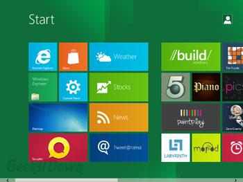
We knew heading into this preview that the Metro UI was likely to be drastically different in appearance so there wasn’t as much ‘wow factor’ for us as it may be for others reading this. Having said that, the new UI does have a bit of wow factor. Touchscreen or not, the look of it is very appealing. Metro UI is something that will need to ‘get legs’, but could really take off among PC lovers if polished with added customization.
News
Staying along the Metro UI theme are several examples of how apps will work on this new platform. In particular we chose the ‘News’ app which comes preloaded with popular rss feeds in common genres. We immediately selected a few feeds to see it in action. By the way, all we really had to do was select it and it was added, super simple. Once feeds are chosen they rotate information like a widget within the ‘News’ app block. All feeds are accessible by clicking the News app block. Similar were the ‘Weather’, ‘Stocks’ and ‘Tweet@rama’ apps. Simple, convenient and useful.
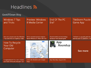
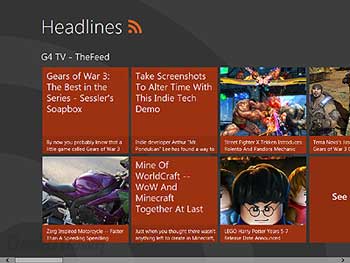
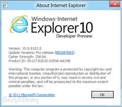
We were interested to see what the ‘Store’ app would entail, but sadly that particular feature is not yet available to preview. However, we were able to see Internet Explorer 10 in action. IE10 looks just like IE9 with the exception of some updates to interpretation of website layout and appearance which moves IE closer towards the level that Firefox and Chrome are at. In app mode, IE10 is slightly different, but the biggest change is really just a copy of how browsers appear on smartphones — large buttons and a hidden address bar until needed.
Suspended Apps
Much like with smartphones and tablets, instead of minimizing or closing apps, apps are now left in a suspended state when users move from app to app. This feature takes some getting used to and we’ll actually follow-up on this in our ‘Top 5 Things We Dislike About Windows 8‘ article. Overall though, it’s an average user’s dream come true. No more remembering to close programs or duplicating open applications because you forgot one was minimized. Just switch between apps without closing others down first, it couldn’t be easier.
While we have resource concerns about this feature, overall with the kind of hardware shipping these days there should be little issue with having ample power and memory to handle average user interaction.
Load Speed
If you are aggravated, annoyed or downright fed up with how long it takes to load your system, then you’re going to love Windows 8. After a much needed improvement in load times over Vista with Windows 7, Windows 8 takes it a step further. You’ll hear and see all sorts of benchmarking data about load times and startup speed, but from experience we can tell you Windows 8 performed way above expectations.
To put it in perspective, we purposely handcuffed ourselves by installing Win8 in VirtualBox on a Vista machine. We supplied it with 2gb (out of 3gb) of RAM with less than 18gb HD space, which is below the recommended 20gb. The system worked flawlessly. Certainly we expected some hiccups and serious lag in load times, however, there were zero hiccups and the only load time delays were during the logout process which we’re chalking up to a combination of resource limitations and active apps kill sequences.
If Microsoft can maintain or even improve the load / startup times, then that will serve as a huge selling point for users to upgrade.
Windows Live Syncing
As a new user, we had the option of using a traditional Windows login or a Windows Live login via an email address. We opted for the traditional since we’re just kicking the tires so to speak, but here’s the info on using a ‘Live’ login. If you use a Windows Live login, you’ll be automatically able to sync all your information, settings, etc. to the cloud. Why is that important you might ask, well for one thing, backups become less of a chore and more of an afterthought. The idea is that eventually, you could login with your ‘Live ID’ on any PC and immediately have your information at your fingertips. It sounds fantastic, but we’ll have to see how they implement it.
Our opinion is that Microsoft could essentially be prepping for an alternative to Google’s already established accounts initiative whereby a gmail address accesses a user’s other synced data. We’re big fans of how Google organizes their services so we’ll hardly complain if Microsoft offers up a similar alternative. If you believe this is a feature worth getting behind, you can secure your ‘Live ID’ before the masses by signing up at https://signup.live.com/.
Final Thoughts
Our overall impression is that Windows 8 could be a huge success for home users. It’s visually friendly, incredibly simple to learn, but still has the deep down details that PC owners have come to love. The Metro UI does take some getting used to and after the second day of testing was still a bit cumbersome for navigating quickly via mouse.
There are a lot of things that we could say need improvement, but keep in mind this is only a Developer Preview and we are a good year away from a final release. Nevertheless, criticism is a good thing and we’ll be dishing some out in our ‘Top 5 Things We Dislike About Windows 8‘ article so be sure to check it out.
You can read other Windows 8 related articles on our Windows 8 News page.
Your Comments
Have you tried Windows 8 Developer Preview? Do you think Windows is on the right or wrong track? What, if anything, are you looking forward to the most about Windows 8? Let us know in the comments!
If you enjoyed or found this article useful, please show us some support by liking us on Facebook or by sharing us on your favorite social website. Thanks!


I’ve been using it for a couple days now, dual-booting on a 3-year-old budget Vista laptop. The Metro version of IE10 has frozen on me a couple times {{ the standard desktop IE10 works just fine }}, but I am impressed at how seamlessly the Metro UI can interact with the standard desktop.
It definitely seems to be the best of both worlds. Microsoft’s established user base and horde of existing software is its greatest strategic asset, and it would have just wasted it all if it had tried to mimic the iPad with a tablet-only OS with which it couldn’t compete.