StumbleUpon is one of the best ways to find new content on the web. Since their start back in 2001 they’ve been a popular way to pass time and surf without destination. In more recent years they’ve been looked upon as one of the better ways to drive traffic to sites and yet still remain a wonderful source of new content.
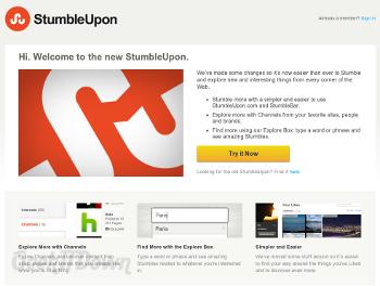
Now, StumbleUpon is ready to re-launch itself with a completely new look, including new logo, website design, profile layout and added features like Channels and Brands.
StumbleUpon’s New Look
The redesign has three main destinations, ‘Home’ which is basically a graphical listing of all your interests, ‘Profile’ which is all your stumbles, discoveries, etc. and has a completely new look and ‘Discover’ which lists ‘Interests’, ‘Stumblers’ and ‘Channels’.
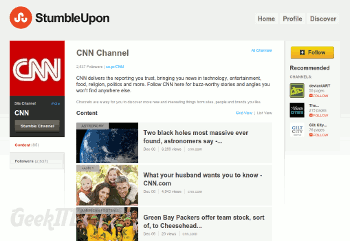
The new home look is simple and is clearly designed with ease in mind. The tiled listing of all interests is straight forward and easy to navigate.
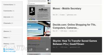
The new profile page is completely different than what users are used to, but is exponentially more appealing. While there aren’t any innovations to speak of, the layout is much easier to navigate with choices aligned down the left side of the screen with all recent stumbles shown as the main focus.
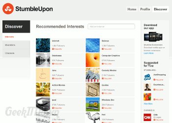
Discover is where StumbleUpon has recommendations for users. Recommendations on interests is pretty self-explanatory. The stumblers and channels recommendations are left unexplained and since some of the channels were off the wall, we can’t really determine how StumbleUpon “recommends” them. At this point it’s a nice feature, but focused targeting seems to be lacking.
Final Thoughts
The StumbleUpon redesign is pushing forward the process of exploring the web by making it easier to discover new sites based on your interests. The interface is much more appealing and simpler to navigate. The addition of ‘Channels’ and deeper integration of the ‘Explore Box’ are definite pluses. The jury is still out on the idea of following brands and channels though since many are already liking them on Facebook or following them on Twitter.
Your Thoughts
Do you like or dislike the new StumbleUpon? What are your opinions on the redesign and added features? Let us know in the comments!
Related Articles:
Discover New and Useful Websites Every Week in the Nifty Websites Collection
If you enjoyed or found this article useful, please show us some support by liking us on Facebook or by sharing us on your favorite social website. Thanks!
