In 2012 we reviewed Todoist in our Nifty Websites Collection series. We were pleased with its synchronization and integration with Outlook and Gmail. Near the end of 2012, we were approached by Doist Founder, Amir Salihefendic with information about the new Todoist mobile app for Android and iOS.
Since that time, we’ve had a chance to work with and test the premium version of Todoist on the Android platform. Now we’re ready to give a review of how this to-do app stacks up and what users can expect from Todoist.
Skip to the end of the article for a special 1/2 price discount on Todoist Premium.
Todoist Review
Learning Curve
As with a number of productivity apps, there can be a bit of a learning curve in terms of functionality and usability. If an app is too difficult to navigate or the complexity of commands is great, then users will move on.
Todoist sidesteps a lot of those problems with short, quick tutorials during the first run of each feature. The guided instruction is great for beginners and although Todoist isn’t incredibly challenging to learn, the tutorial helps get users up and running right away.
Projects
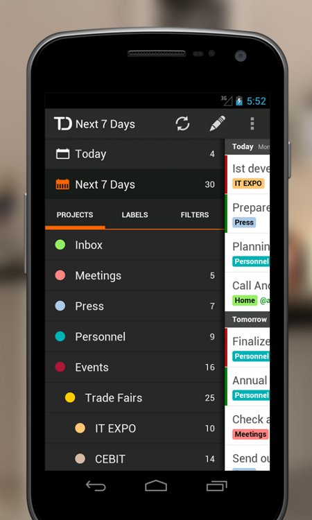
Projects are Todoist’s way of sorting and organizing tasks. Each task or to-do item is categorized by project. The idea being that not everyone wants to view tasks by date, so sorting by project provides another method of task organization.

Projects are required in order to add tasks which can seem a bit cumbersome at first, but part of the app’s appeal is it’s ability to organize your tasks so by forcing a task into a project you’re automatically more organized. Those with simple to-do list needs would benefit from a default categorization of Tomorrow or This Week. Perhaps Todoist will implement something similar in the future.
Tasks
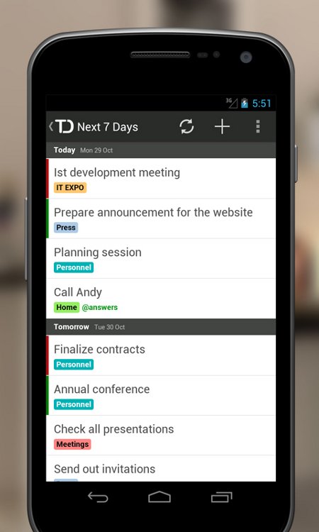
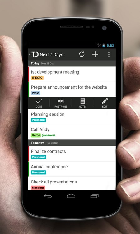
Tasks are wildly simple to create. A simple tap of the + sign and away you go. Tasks can have due dates and labels (tags) with prioritize and indent features. Tasks are of course editable and can be annotated with notes or postponed (postpone feature automatically moves the task to the following day).
The postpone feature is especially nice since often tasks are left incomplete or unattended for one reason or another, however we’d like to see more options such as postpone for a week or next Monday or even add a calendar feature to choose specific dates.

By default Todoist opens on the Tasks list for Today. We aren’t overly thrilled with that and would prefer it opened to the main menu area so that users can choose which project or timeframe they’d like to view.
Labels
Just about any decent organization or productivity app these days has to employ a tag/label system. They are a phenomenal way of tracking and organizing items. To that end, Todoist has incorporated labels which again separate tasks for more precise viewing.
I admit, labels and tags are something I employ on a regular basis no matter which app or program I’m using. They are crucial in remembering tasks. Todoist labels work exactly as expected and offer color coding to further enhance the feature.
There is one drawback to the labels feature. It’s a premium feature. While labels are important, we’d like to see them as a standard feature as is the case with other productivity type apps.
Other Features
Tasks can be filtered down by using queries which Todoist applies via short phrases and partial words to lessen the amount of typing. Examples include “tom”, short for tomorrow or “4 days”, to highlight tasks due in the next 4 days or “od”, short for overdue as well as many other queries.
Email reminders are not specifically tied in with the Android app, but can be accessed through the Todoist web app. It’s not a deal breaker feature for the mobile app, but the email reminder feature is something that would enhance Todoist and could be a nice trade-off premium feature to get labels put in the standard version.
Interface
At first the interface came across as bland and barren, but after some time working with it began to feel comfortable and simplistic (in a good way). Navigating between tasks, projects, labels and filters in Todoist is easy with task view cleanly displayed with labels and project colors.

On a tablet the app is appealing and equally appealing on smaller smartphone screens.
Todoist is fast and responsive. Todoist syncs as well if not better than any other app we’ve tested. Swipe works smoothly yet Todoist caters to all users by utilizing tap between screens as well.
Conclusion
Admittedly, I’m a productivity app junkie. Organization, productivity and downright useful apps get my attention. Todoist fits a hole that is otherwise missing from simple note-taking apps and expands on middle of the road task filing apps. The combination of task recording, scheduling and project/label organization puts Todoist in a class with other top productivity apps.
Downsides include typically standard features such as labels packaged in a premium version and the rather odd position of ‘Add Project’/’Add Label’ buttons in comparison to other Todoist buttons.
Overall, Todoist functions exceptionally well, is ultra fast, optimized for all screen sizes and provides a need in the app market. As a free standalone app, Todoist is definitely worth the download and we highly recommend it. The premium version, at $29/year, is worth the cost if you intend to use Todoist as your primary source for task management.
Special GeekITDown reader discount (valid through 1/10/13): 50% off Todoist Premium
If you enjoyed or found this article useful, please show us some support by liking us on Facebook or by sharing us on your favorite social website. Thanks!
Be sure to subscribe to our Newsletter for updates and contest information.


App review is very difficult process and I appreciate your effort for provide useful information.I recently visit one Iphone App Some website is very useful which is giving such data.